“Ahum Peter, you just turned 50 and now your new logo says “Anno 1880”, that’s just over 133 years and something else than 50! Is everything alright with you?” I can almost hear you think it.
When I started Simoons & Company back in 2010, I chose the name for a couple of reasons. The first one is that I am practicing what I preach. My company is Alliance based, maybe even network based. It is a modern organization expanding by network and alliances rather than by employees. Hence it is me and the network, or in other words Simoons and his Company, in short Simoons & Company.
There is however, a second clarification behind the name. My grandfather Daniel Simoons Jr. was an entrepreneur running a company in Amsterdam by the name of Simoons & Co. Originally a company that was started by my great grandfather Daniel Simoons Sr. in 1880. At that time the “& Co.” was referring to the old “companion”, as in the meaning of a business partner that was a shareholder together with my great grandfather. History is a bit fuzzy about what happened in the company over time, but when my grandfather celebrated his 25 years in the business in 1932, he was already the sole shareholder.
Simoons & Co. ceased to exist shortly after the second world war when no successors to my grandfather were to be found among his children. I never had the pleasure of knowing my grandfather in this life as he passed away about six years before I was born. I was raised however with the stories of what a remarkable person and businessman he was. Hence the second meaning behind Simoons & Company is a little tribute to my grandfather who I never knew.
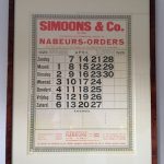
 While redoing my website into a new layout with new colors, I felt it was time to redo the logo too. At first, I used the red colors my grandfather used in his logo on the old calendar of April 1929 that is hanging in our living room. But on second thought I felt it would be great to reinstate the old logo of Simoons & Co, conform today’s meaning the “& Co.” is the abbreviation referring to the official “& Company”. The logo is a simple one but has a style that represents the trustworthy values a Simoons & Company logo should have.
Somehow it seemed impossible to find the same letter font as used in the 1929 logo. After an extensive search, I decided to go back to the future by creating the new logo based on a scanned version of the 1929 calendar logo.
Back to the future: “anno 1880, reinstated in 2010”; What do you think?
Cool story. I love it!
Thanks Rebecca! In the mean time I have updated the logo to represent more personal brand, but the official company name remains Simoons & Company and hence the official logo comes back in many occasions.
Peter,
A great tribute and a handsome logo.
I wish you much success!
Jason
Thanks Jason!